The post-PC era has arrived with a flood of smart phones, tablets and other mobile devices into the marketplace. As companies seek out new and profitable market segments, wearables have emerged as the next big thing; and without a doubt, smart watches are one of the most popular types of wearable. In fact, there are already many smart watches on offer; but unfortunately, not all of them are quality products.
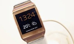
Case in point: the Samsung Galaxy Gear smart watch, launched in September 2013. This watch received poor reviews by industry experts and end users. It is rumored that the Galaxy Gear had a return rate as high as 30% in the United States, indicating the level of customer dissatisfaction with this product. According to Ian Fogg, an analyst at IHS, “The device exhibits multiple shortcomings, including a high price tag, a short battery life, and … limited compatibility” and “It appears that Samsung’s Galaxy Gear smart watch is a prototype masquerading as a commercial product.” Despite Samsung’s excellent track record delivering high quality consumer electronics, the Galaxy Gear was obviously an utter failure. From this cautionary tale, we learn that even the best company can fail in new markets and that this failure is almost guaranteed if new products fail to satisfy end users.
Figure 1: Samsung Galaxy Gear
Smart Watch Test Results
As product certification experts, Allion Labs, Inc. (Allion) must keep up with all the latest consumer technology trends.
In September 2013, Allion evaluated smart watches from three leading vendors. At the time of testing, there were primarily two types of smart watch on offer. The first type came equipped with a small touch panel screen, often with smart-phone style gestures and on-screen keypad controls. The second type was more retro/minimalistic, using off-screen buttons for user input. Some smart watches also accepted voice commands, but this feature was not used as a primary user interface.
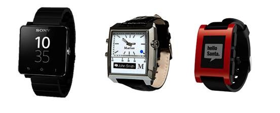
The smart watches we selected for testing were the SONY Smart Watch 2, Martian Passport Watch, and Pebble Smart Watch, as shown in Figure 2 below. These smart watches were purchased in the second and third quarters of 2013. To evaluate these three smart watches, our team utilized a heuristics-based test protocol with the help of five power users. The testing focused on overall product quality in terms of smart watch appearance, performance, and UI.
Figure 2: Sample Smart Watches (from left to the right):
SONY Smart Watch 2, Martian Passport Watch, Pebble Smart Watch
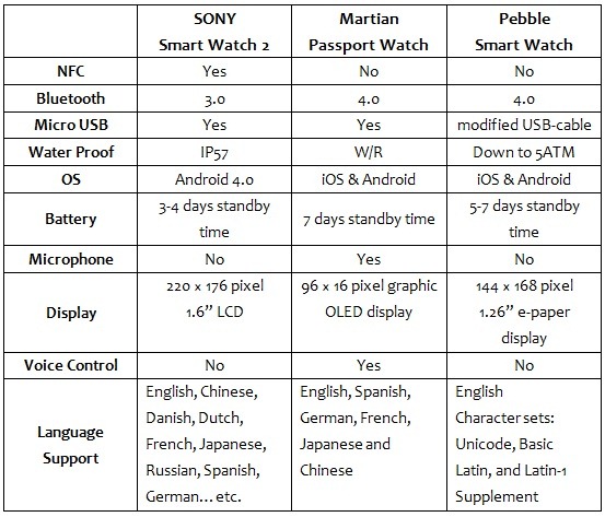
Each of these smart watches exhibit their own unique style. The SONY Smart Watch 2 adopts a touch interface with a 1.6 inch, 220 × 176 pixel, LCD monitor. The Martian Passport Watch combines a traditional watch design with a text-only, 96 × 16 pixel, OLED monitor and two buttons on the left for user input. The Pebble Smart Watch has a 1.26 inch, 144 × 168 pixel, e-paper monitor and four buttons for user input. More detailed device specifications are provided in Table 1 below.
Table 1: Sample Smart Watches – Specifications
Our smart watch testing was divided into the following three categories:
Appearance, User Interface (UI), and Functionality. Five power users rated each smart watch, giving each one a score between zero (0) and ten (10) for each test metric, ten (10) indicating high satisfaction and zero (0) low satisfaction. If the product could not support a certain function or if there was a compatibility issue, it was given a zero (0) rating. The smart watch test scores are described below.
Appearance
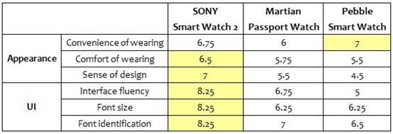
As shown in Table 2, the SONY Smart Watch 2 scored better in “Comfort of wearing” and “Sense of design” than the competition, but the Pebble Smart Watch scored slightly higher in the “Convenience of wearing” metric. Overall, the SONY smart watch seemed to have a better overall aesthetic design than the competition.
User Interface (UI)
As shown in Table 2, the SONY Smart Watch 2 beat the competition in all three UI test metrics: “Interface fluency”, “Font size” and “Font identification”. Our power users were fond of the larger LCD display on this watch, which can display six app icons onscreen. The Pebble Smart Watch scored lowest on the “Interface fluency” metric, as our power users had difficulty pressing its side-mounted buttons.
Table 2: Test Scores – Appearance & UI
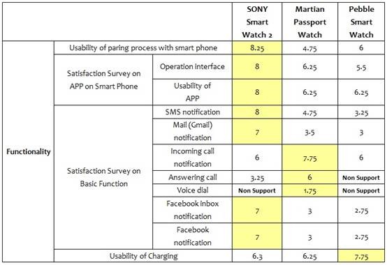
Table 3: Test Scores – Functionality
Functionality
Smart watches are, in some ways, simply a new kind of smart phone accessory; and as such, smart phone interoperability is of vital importance for product quality. Other product quality criteria include the accessibility and usability of software applications (apps) that enable smart watch and smart phone interaction.
In our smart watch testing, power users ranked SONY highest in terms of smart phone pairing and smart phone app satisfaction. The SONY Smart Watch 2 scored well on the “Usability of pairing process with smart phone” test metric due to its ability to quickly pair with Android-based smart phones using its built-in NFC. The Smart Watch 2 also took the lead in “Operation interface” and “Usability of APP”, indicating a clear preference for its Android phone app in these test metrics.
The next set of test metrics (Satisfaction Survey on Basic Function) included standard use cases: receiving notifications, answering calls, and social media monitoring. Once again, the SONY smart watch outperformed the competition in most test metrics, including “SMS notification”, “Mail (Gmail) notification” and Facebook notifications. However, the Martian Passport Watch swept the board in call-related functionality, with higher scores for “Incoming call notification”, “Answering call” and “Voice dial”. The Martian smart watch was the only one of the three that could perform voice dialing, but this function was not accurate and had a high rate of failure, which explains the low score (1.75) on this test metric. However, this smart watch was able to notify users of incoming calls and allow for call pick up through its built-in noise-canceling microphone and speaker. In comparison, the Pebble Smart Watch was regarded poorly by our power users, with lower scores in most of these tests.
Interoperability
Smart watches act as digital assistants by forwarding notifications from smart phones to their owners; therefore, interoperability (IOP) between smart watches and smart phones is vitally important. For interoperability testing, we selected eight smart phones, including six Android phones and two iOS phones. The test coverage included the same functionality that we tested previously, such as SMS notification, incoming call notification, and social network notification.
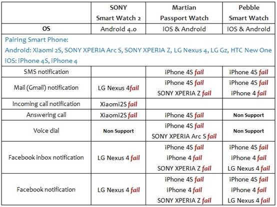
The Interoperability test results are found in Table 4. These results clearly show that all three smart watches have IOP problems. For example, the SONY smart watch could not receive mail or Facebook notifications from the LG Nexus 4, while the Martian smart watch experienced issues with the SONY XPERIA Z. In our view, these results indicate that companies would benefit from more comprehensive IOP testing of smart watches.
Moreover, our Bluetooth® Qualification Expert (BQE) found that although the Martian Passport Watch claimed to support Bluetooth 4.0 Low Energy technology, there was actually no matching Bluetooth® profile on the device. There was also a discrepancy with the Pebble smart watch because it matched the Bluetooth 2.1 Enhanced Data Rate specifications, which conflicted with its claims of Bluetooth 4.0 compatibility. It seems clear that developers could benefit from more rigorous Bluetooth® certification testing and consultation service. This would ensure that smart watches contain the match Bluetooth® specifications and thereby enable better device interoperability.
Table 4: Test Scores – Interoperability
Smart Watch Test Summary
1. SONY Smart Watch 2
It is a stylish product with high scalability. UI performance is good, but the display resolution could be enhanced to attract even more attention. The associated smart phone apps need to be installed one by one, which makes smart watch setup a bit complicated and time-consuming. Monitor sleep mode does not transition smoothly to black, which may confuse some users. After testing some social media apps, we found that users could not set all posts on Twitter as read and that some Facebook notifications were either lost or delayed. Besides these issues, suggested usability improvements include the ability for users to adjust the location of smart watch apps on the monitor, add a light sensor to adjust display brightness automatically, and voice control functionality.
2. Martian Passport Watch
The associated smart phones apps are not very easy to use. The watch dial is too cumbersome and not comfortable to wear. The Bluetooth® connection failure rate was too high. Even worse, smart watch apps malfunctioned; e.g., voice dial ID accuracy was poor and camera control from the watch was unable to autofocus. This watch is not designed very well; it would be better with a bigger display and a lighter weight.
3. Pebble Smart Watch
We found it inconvenient to download data to the smart phone first and then dump it to the smart watch when installing smart watch apps. The smart phone app seemed unnecessarily big at 11 MB. The app interface is also too simple and there are too many instructions. In installation mode, there are no explicit instructions telling users which buttons to press on which side. No multi-language support was another big shortcoming for our users. When the connection is terminated, the smart phone app keeps searching for the device resulting in high power consumption.
Suggestions from Power Users
The perfect coordination of software and hardware in product design is important because customers now expect attractive, convenient, and reliable products. We look forward to SONY and Martian offering more choices for smart watch monitor themes. For Pebble, with its e-paper monitor, it would be better if its LED lights would turn on automatically, so that users could use it more conveniently in dark environments. Developers should simplify the installation process for smart phone apps and arrange simple pictures to instruct users step-by-step, instead of using complicated interfaces with too many words. To avoid water damage, SONY and Martian include a cover for the charge port; but this cover is easy to break on the Martian smart watch. We also feel that smart watches should also offer GPS navigation and healthcare functions to fully leverage the advantages of Bluetooth® Smart technology. All these suggestions would go a long way to improving product usability and overall user satisfaction.
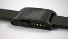
Figure 3: The Pebble Smart Watch has an exposed metallic charge port
that makes it convenient to recharge, but also at risk of short circuiting
Unfortunately, many potential customers are still waiting to purchase a new smart watch because existing products are either: too expensive, poorly designed, or inconvenient to use. In addition, there are only a few smart watch apps in the various digital marketplaces. Taken together these factors are restraining growth in this product category.
In this test, there is no denying that compatibility problems existed between some smart watch and smart phone pairings. As a result, smart watch developers should redouble their efforts to improve smart watch interoperability. Once these interoperability issues are sorted out, developers can then begin to think about adding new smart watch functions onto stable platforms.
As a professional test lab, Allion can conduct one-stop certification testing of smart watch touch displays and wireless technologies, such as Bluetooth 4.0. Allion has collected thousands of the latest mobile devices for the express purpose of interoperability testing. Allion also offers valuable consulting services, such as competitive analysis, to assist clients succeed in global markets.


